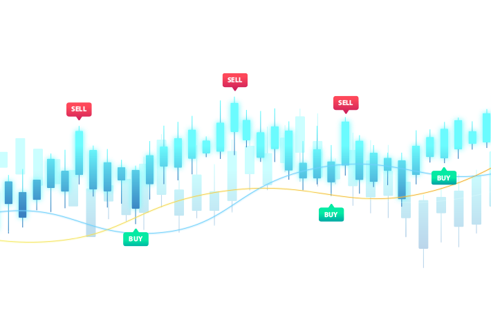
Chart Patterns – a Picture Is Worth a Thousand Words
Locating chart patterns on price charts have been equated by the naysayers as finding patterns in the cloud. But if there are traders who have successfully traded and made money on the basis of chart pattern then there has to be something to it.
Agreed chart patterns are subjective, which is why it is always termed as an art rather than a science. But the amount of work that has gone in detecting and testing chart patterns by a number of players across all countries would equal that on any study in science. It is perhaps because they work some of the time and the high payoff when offer when they do, we find many followers of chart patterns in the market.
Traders have been successfully able to segregate patterns based on where they appear on the chart. Patterns are divided based on reversal and continuation pattern.
Reversal Patterns
These patterns occur at the top or bottom of a price move. There is further segregation here. Certain patterns are seen only at the top of a price move while some are seen at the bottom. We shall look at the most common reversal patterns.
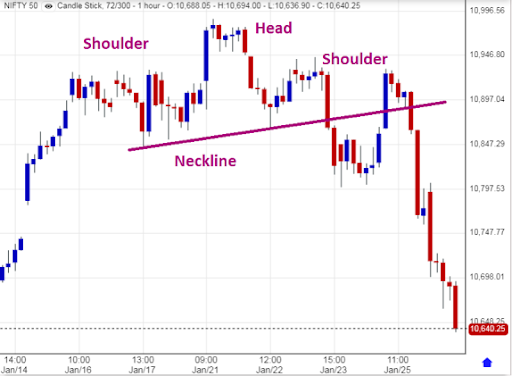
Head and Shoulders
One of the classic reversal patterns – the Head and Shoulder pattern gets its name from the shape it forms on the price chart.
The Head and Shoulder pattern has three peaks with the middle one representing the head – which is also tallest among the three peaks. This pattern appears at the top of a rally and gives a strong reversal signal.
Imagine a situation where the market is steadily rising, making new higher highs and higher lows. With every new peak, new investors join the rally, mutual funds get more money to invest in the market and with every correction witnesses more buying interest. Analysts increase their price target and media splashes bullish news on their front pages during this phase of the market.
As more investors join the market new highs are created, market volume picks up and valuation goes through the roof. However, here the smart investors and trader notice that it is taking market much more effort to push prices higher.
A new high is made but it has barely crossed the previous high and it took a lot of volumes to push prices higher. The trader raises his first red flag at this point which coincides with the top of the Head in the pattern.
The correction that comes after this high is sharp and on high volumes, the second flag is raised by the trader. A few days of selling could cover the distance that took the bulls many days to cover.
The market again tries to bounce back with clients being advised to buy more and the fall in price termed as a great time to re-enter. The market again tries to rise but despite high volume, it is nowhere near the previous top. It makes a lower top and starts falling.
The support line connecting the higher lows called the Neckline is broken and now we have a classic ‘Change Of Trend’ breakout where more traders come to sell taking prices further down.
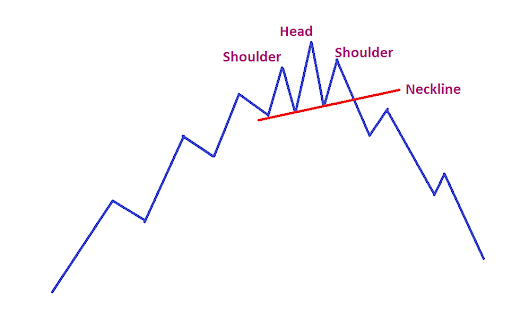
The good part about Head and Shoulder is concerned is that they give a hint on how low they can fall. The distance between the top of the head and the neckline is the same that the market may fall after it breaks the neckline.
Head and Shoulder patterns are generally formed at the top of a rally, however, they are also formed at the bottom but here they are in an inverted form. The head in an inverted Head and Shoulder pattern is the lowest point the market has reached which is followed by a higher low which is the right shoulder of the pattern.
Volume in these cases replicates the pattern where the highest volume is at the peaks.
The Cup and Handle Pattern
This pattern is found at the bottom of a bear market.
Consider a situation where there is little interest in the market and prices continue to slide slowly downwards with declining volume. At the bottom, some value investors and insiders decide to start nibbling at the stock. The stock slowly rises because of their buying. But the buying is so slow that it does not create any buying spikes.
Price rises to the previous top which now acts as a resistance. Here there is selling pressure from those who were waiting for prices to rise to their entry levels or a point where their losses can be reduced. But by now there are others who see merit in buying. As a result, prices do not fall much but after a small correction it continues to rise to break the previous top on higher volume.
What we have seen is a construction of a Cup and Handle pattern where volume also forms a similar pattern.
Here too the pattern gives an idea of how high the prices can go after the breakout. The distance between the bottom of the cup and the neckline is expected to be covered in the run up.
Double Tops and Bottoms
Double tops and double bottoms are one of the most common patterns seen in the market. They are especially seen when the market is in a sideways motion.
Here the price comes to test the previous top and low and rebounds from there. Traders find the previous peaks as good points to get a good risk-reward trade, hence these points are generally crowded and any breakout from this position is a high volume breakout.
The ease of recognising these patterns make them one of the favourite patterns among new traders.
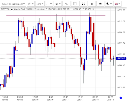
When the same support and resistance level is tested thrice the pattern is called a Triple Top and Bottom.
Though the double and triple tops and double bottoms have been included in the Reversal segment they are also seen during continuation, especially when the market is pausing to catch its breath.
Continuation pattern
There are patterns that are formed during a bull and bear phase of the market. Some like the double and triple tops and bottom are found during both reversals as well continuation phase of the market.
Continuation patterns are preferred by momentum traders as they signal a continuation of the old trend. We shall now look at some of these patterns
Triangles
There are three type of triangle pattern that is visible in the market, especially during a bull and bear run in the market. These are the symmetrical, ascending and the descending triangle.
Take the case of markets moving higher. The market is making higher high and higher low, typical of a bull market. But suddenly there is a lower top after a correction. The buyers have now paused thinking that they have reached the top. But then the market rebounds from a higher low suggesting a continuation of the trend.
The attempt to move higher is again stopped by a lower top but again the market makes a higher low. This continues for some more time. We are now in a situation where the market is tightening in a smaller range like a spring. The chart now looks like a Symmetrical Triangle.
The situation continues until the time that there is a breakout. Though there is no way to tell which way the market will move, it generally moves in the direction of the original trend, which in our case would be the market moving higher.
The diagram below shows how the chart pattern appears in the market.

In the case of an Ascending Triangle the market hit a wall in the form of huge selling at one price or in a small range, probably by a big shareholder or an institution that is keen on selling at one price point.
But buying continues in the stock and after a small correction, it again meets with the continued selling. This continues for some time with the correction getting smaller every time as more buyers join in. The moment this entity’s selling is over and the market has absorbed his quantity we see the market resume its rally.
In the case of a Descending Triangle, the opposite is true. There is a big buyer in a falling market. But the selling pressure is so huge that even after his buying is over the selling continues and the market falls after forming a Descending Triangle. Here the market makes lower tops thus giving the image of a Descending triangle.
Flags and Pennants
Two of the most commonly traded chart patterns by momentum traders are the Flags and Pennants. These are short term high momentum trading patterns which are formed after a short but sharp spike in the prices.
In the case of a Flag pattern, the initial sharp rise in price resembles the Flag Pole. The pause after this sharp rise resembles a Flag which is actually a consolidation pattern. But after a short pause where the market catches its breath, other buyers join in and the previous move continues.
In the Flag pattern, the body of the flag is considered to be the middle point of the rally. The market is expected to continue the similar distance it did from the bottom of the pole to the flag.
If the consolidation phase is sloping slightly downwards and narrowing, the pattern is termed as a Pennant.
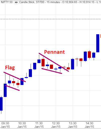
Both the Flags and Pennants appear in a rising as well as falling market. These patterns are visible more frequently in the shorter time frame where we see price spurt and crash more frequently.
Conclusion
There are many chart patterns in the market and each has their own risk-reward ratios or trade offs. Some are easy to site while others require a trained eye.
The only problem with the chart pattern is the subjectivity element. Unless the pattern is very obvious no two technically analysts will agree on what they see in the market.
But when it is so obvious that everyone can recognise it, the pattern does not work because everyone will jump on it at the same time and spoil the pattern.
How Would You Rate This Chapter?
Next
Comments (0)